UX Design Case Study
As a UX designer, I have the ability to see the design process through from beginning to end, including:
creating personas, empathizing with users, defining user pain points, conducting research and interviews, coming up with ideas for design solutions, creating user flows, information architecture, wireframes, mockups, low and high-fidelity prototypes, testing designs through usability studies and iterating designs based on user feedback.
The following case study was done as part of the Google UX Design Certificate course. It gave me the opportunity to create a product from beginning to end.
DATE
December 2023
ROLE
Lead UX designer, UX researcher
CLIENT
Google UX Design Certificate
DELIVERABLES
Create personas, define user pain points, conduct research and interviews, user flows and information architecture, paper and digital wireframes, mockups, low-fidelity prototype, sticker sheet, high-fidelity prototype
Design prompt: Design an app that allows parents to submit their child’s clinical symptoms before a pediatric appointment.
Goal
The product will allow users to submit their child’s clinical symptoms to the healthcare provider before their appointment. This will reduce the wait time, maximize the time with the healthcare provider, and alleviate some of the stress of dealing with a sick child by allowing them to take care of some of the initial appointment intake from home.
My process
I started by empathizing with users to determine my research goals. After conducting user interviews, I built an empathy map and identified user pain points. I used this information to create a persona to help clarify my target audience and create a goal statement for my app.
After completing a competitive audit, I used rapid sketching to ideate. Once I had the product idea ready, I outlined a user flow and started to draw wireframes to outline the digital experience. Next up was to design the information architecture and create a mobile app sitemap. Once I defined the hierarchy of the product, it was time to transition the paper wireframes to digital wireframes and create a low-fidelity prototype. I conducted a usability study and made some modifications to the design before creating a sticker sheet with components to be used throughout the product. Finally, I created the high-fidelity prototype for the mobile app and implemented feedback to make the product a true representation of the intended user experience.
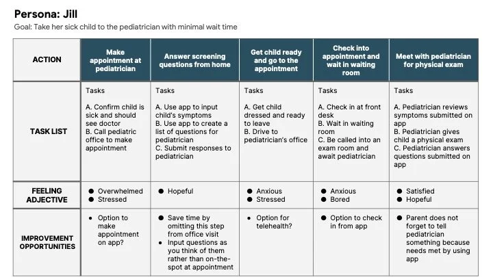
Persona
Jill is a mother of 3 young children who needs to answer initial pediatric screening questions from home because she is overwhelmed and would like the appointment to be quick and efficient so she can get her sick kids home as soon as possible so she can resume her daily routine.

User journey map
An app could help Jill save time at the pediatrician’s office by allowing her to submit her child’s symptoms to the doctor’s office before their appointment.
Sitemap
The app will have 3 basic user flows with the main flow taking the user through the process of entering and submitting their child’s symptoms to the pediatrician’s office.

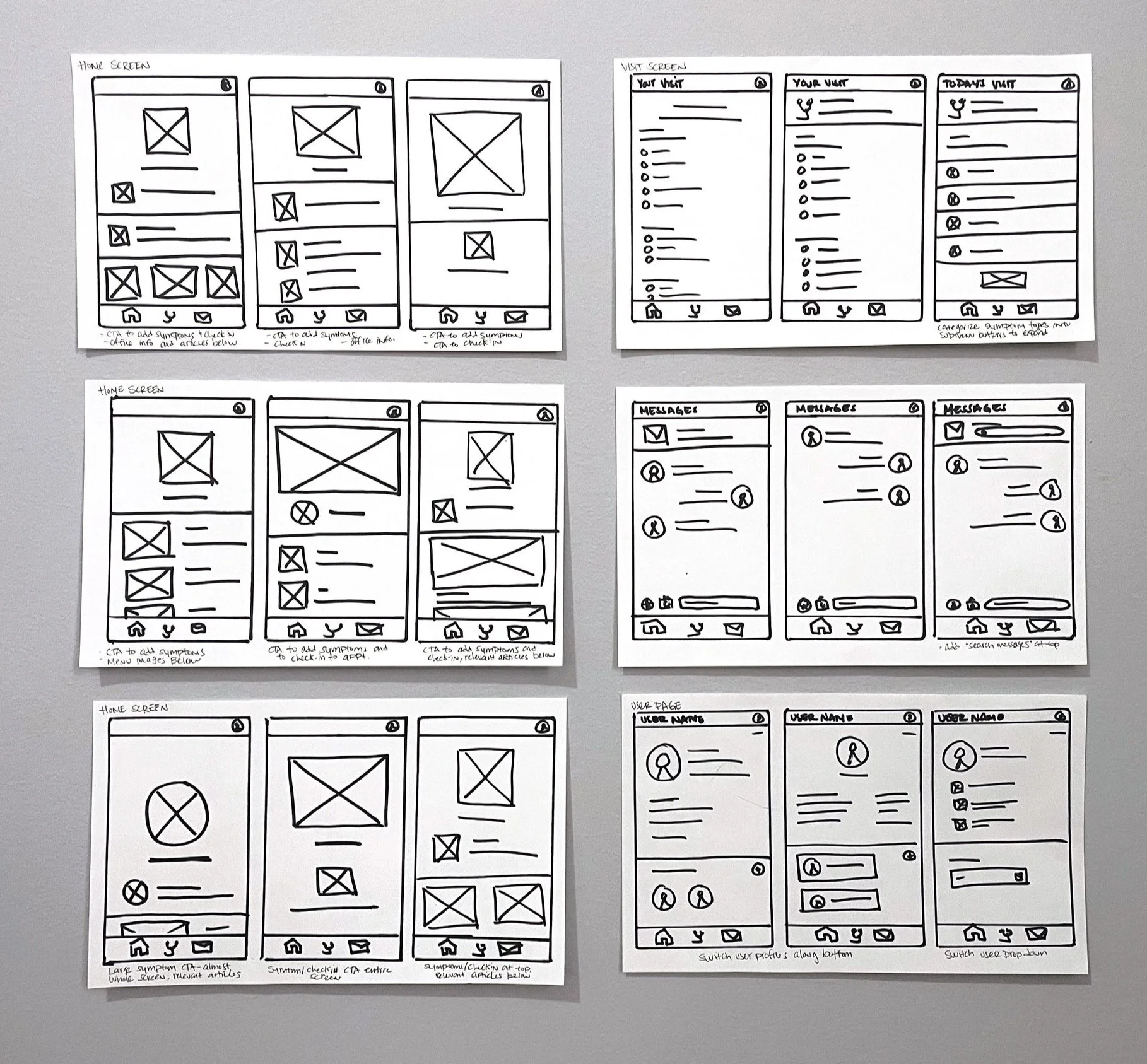
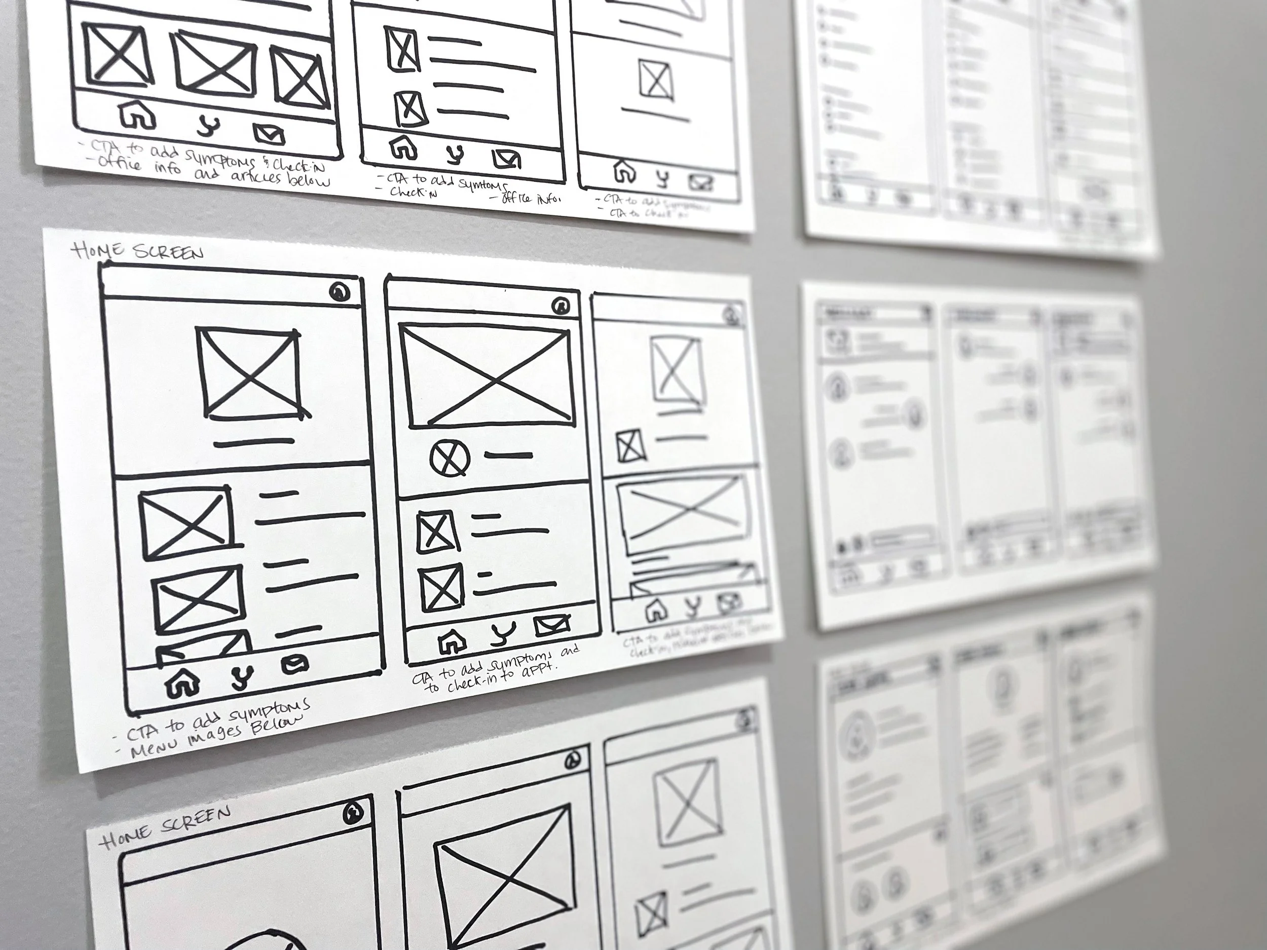
Wireframes
My primary goal on the homepage was to make the “Add Symptoms” CTA very large and prominent in the hierarchy. The main function of the app is for the user to add the symptoms, so it made sense to have this CTA take up a lot of space.
After reviewing the wireframes with peers, I found that making the “Add Symptoms” CTA a circle would alert users to click it right away. This shape reads more like a button prompt than the square version.
Low-fidelity prototype
Usability study: findings
Overall, users found the product easy to use, but had the following to say about the prototype:
Users want to see a confirmation page before submitting their symptoms to their healthcare provider
The list of symptoms is too long and overwhelming; there was too much scrolling
An option to add a new user is needed
Mockups
I created mockups based on the usability study to improve the design based on user feedback.
A confirmation page was added before the user submits the symptoms and questions to the pediatrician
The list of symptoms was reduced to a more common, general list of symptoms
A new user page was added

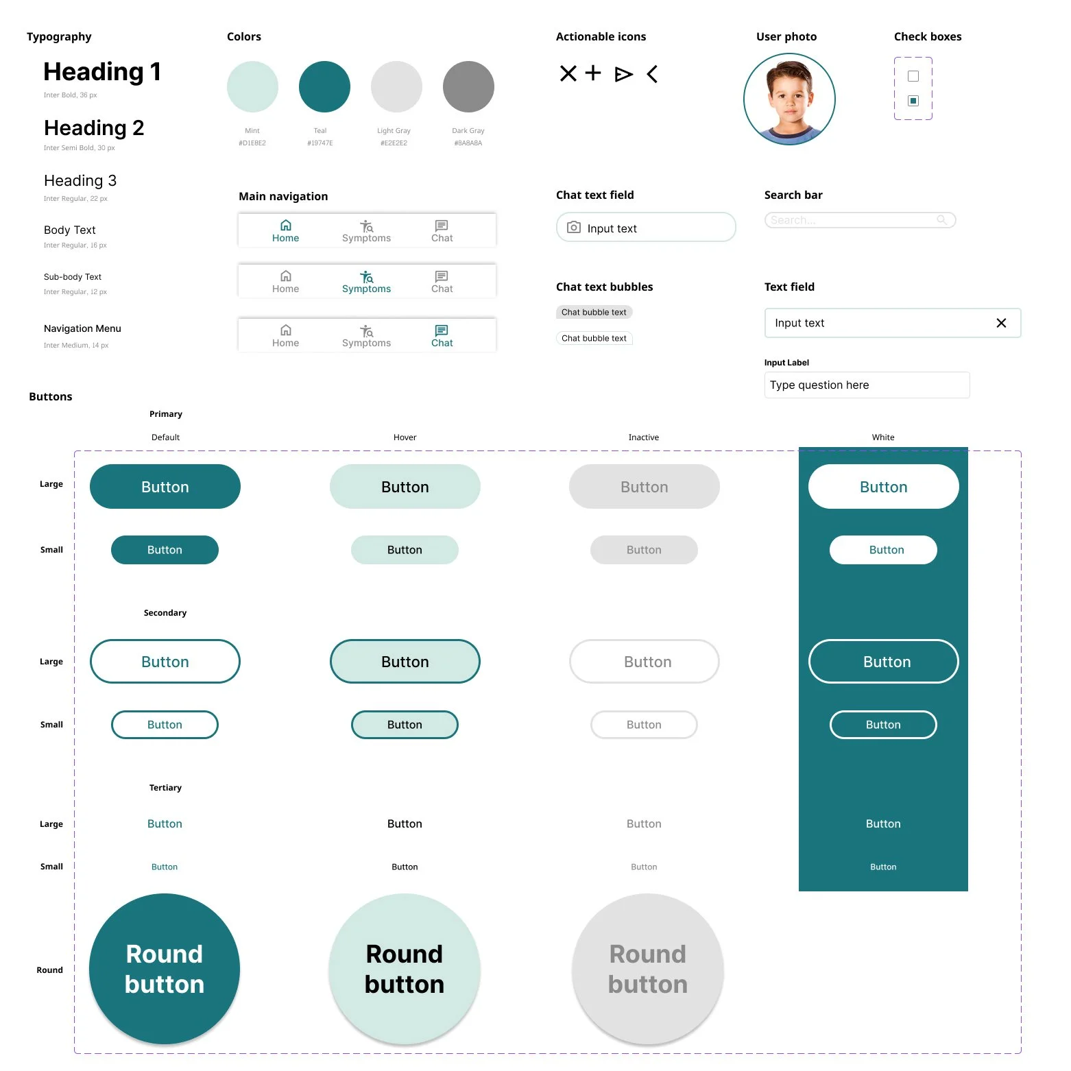
Sticker sheet
High-fidelity prototype
Accessibility considerations
To improve the app functionality for people with different types of disabilities, I made the following considerations for accessibility:
I checked the colors I used in my app on the WebAIM website to make sure everything met the Web Contrast Accessibility Guidelines
The checklist I created for the symptoms list can be tabbed through in case a user is using a keyboard rather than their fingers
I made sure to include heading hierarchy for those individuals who rely on screen readers
Conclusion
I was able to create a high-fidelity prototype of the symptom check-in app that allowed the user to not only enter their symptoms before their appointment, but to also record any questions they had for their healthcare professional to be answered during the appointment. This will reduce the wait time at the pediatric office by eliminating the intake step. This product can be modified to meet different healthcare needs. For example, the symptoms list can be adjusted for adult PCPs or specialty healthcare providers. The next step is to create a responsive website to accompany the app to make the product available to more users across multiple device types.
